Project 01
Developing a Brand and Visual Language for a New App
Name Generation | Brand Identity Design | Illustration + Animation | UX-UI Design | Brand Collateral | Web Design | Strategic Marketing
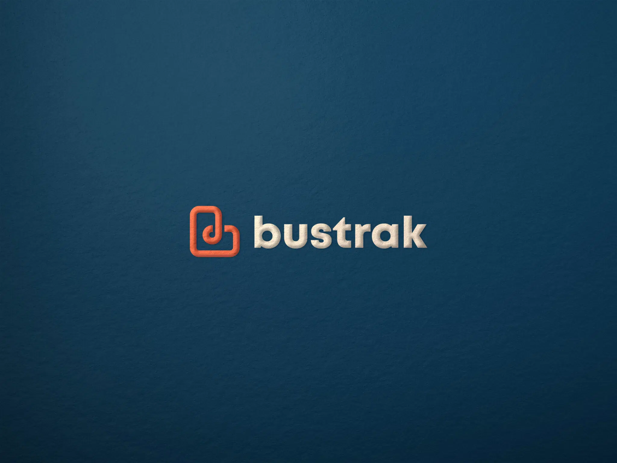
DESIGNING A BRAND THAT CAN THRIVE IN A DIGITAL WORLD
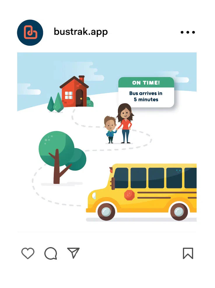
Ripple was challenged to name and design a brand identity system that could quickly resonate with parents, bus drivers, schools and bus companies. This included developing an approachable brand tone, an impactful colour palette, and a friendly illustration style. These three assets had to be able to communicate key features and benefits of the software in a way that is both intuitive and visually appealing.
A STRONG DIGITAL PRESENCE
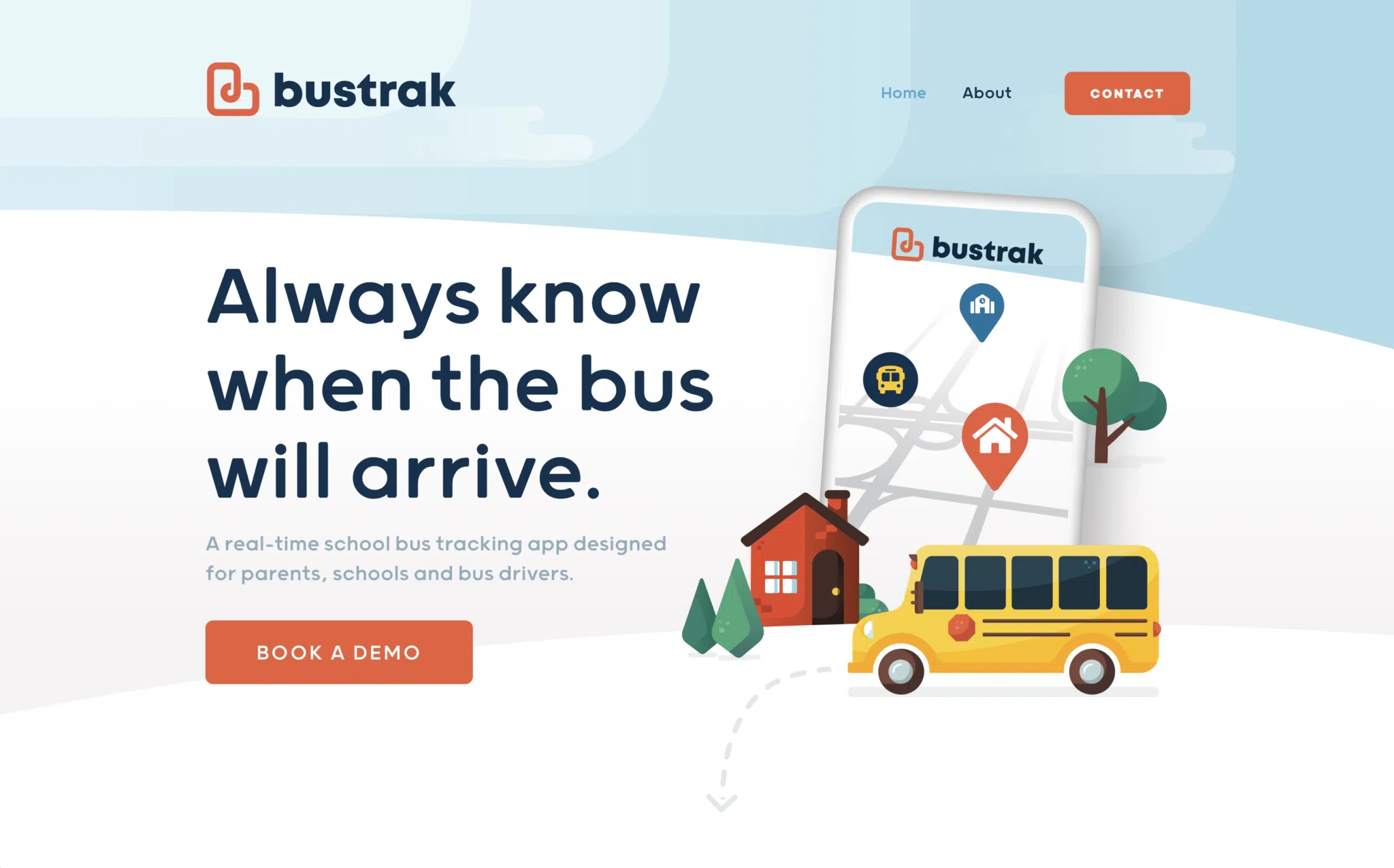
Bustrak joined forces with our design team, and together, we made it our mission to create a cohesive experience across all potential consumer interactions. The new website’s responsibility was to showcase all the brand visuals working together, highlight the app’s user-friendliness and become a robust sales tool for the app.
TRUE SIMPLICITY
INVOLVES SOLVING
COMPLEX PROBLEMS
The new brand identity showcased an approachable software feel, which transferred well to the app’s user interface. Collaborative work between Ripple and the Bustrak team resulted in a seamless, user-friendly app experience. Our team couldn’t be more excited about the results!
‘‘
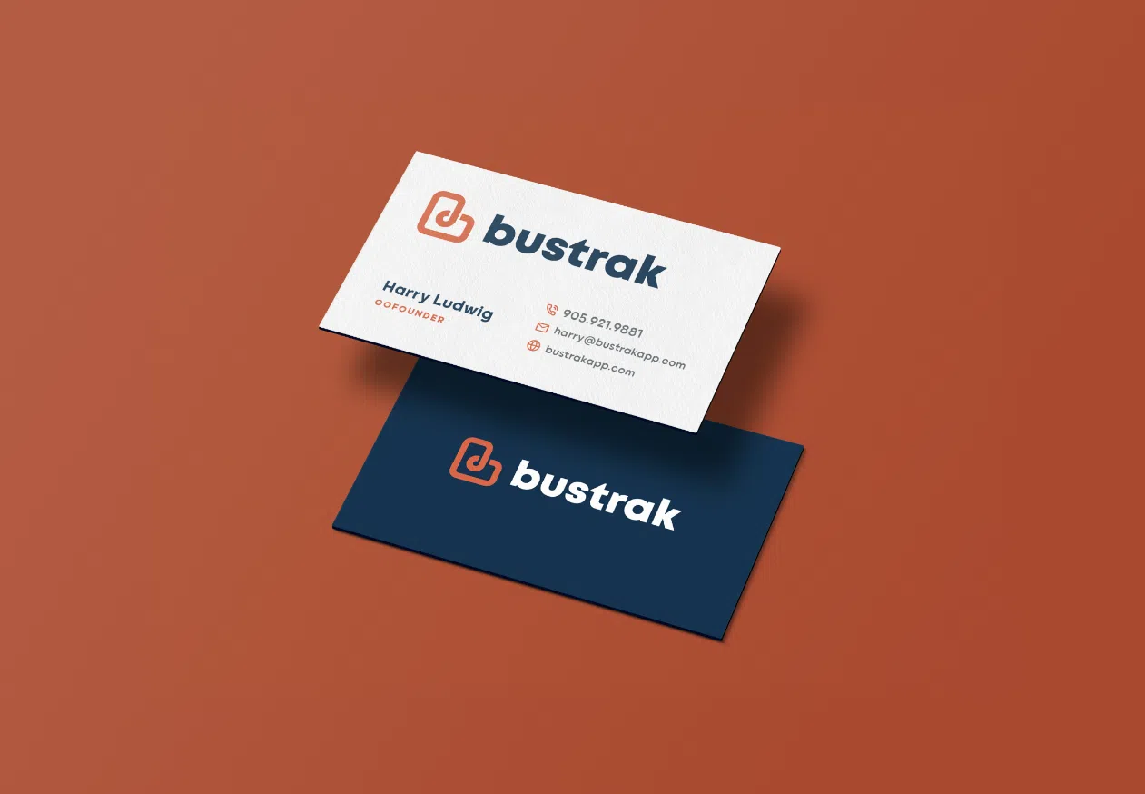
ENSURING A CONSISTENT ROLL-OUT
Similar to this project’s digital design portion, every physical branded piece had to reflect the same approachable look. As we move forward as ambassadors for this exciting brand, we look forward to designing more professional and industry-leading brand collateral.
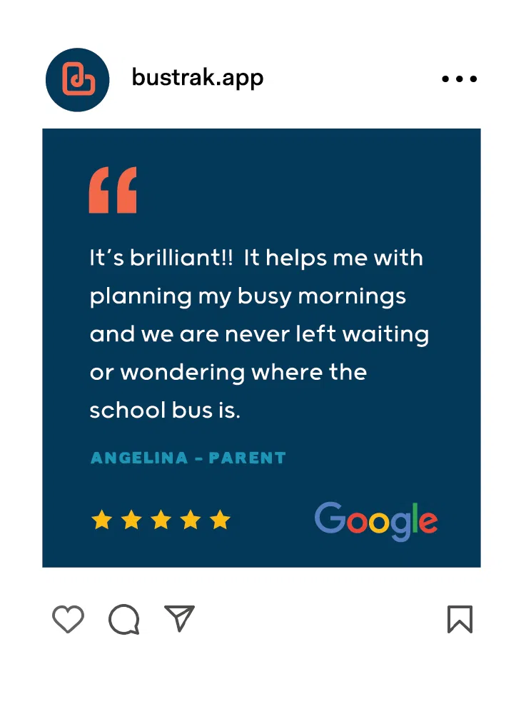
MOVING FORWARD
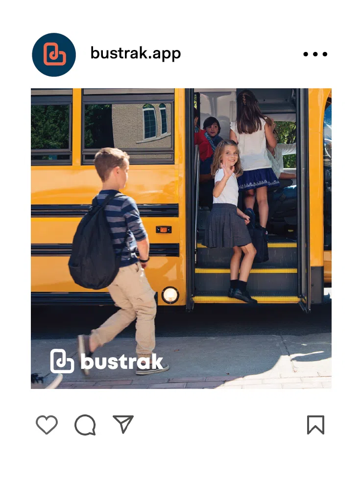
Starting with social media management, we have been tasked with keeping Bustrak at the top of consumers’ minds through digital marketing. As Bustrak grows, we plan to execute a robust marketing strategy of engaging content and compelling brand visuals. Exciting times are ahead for both Bustrak and Ripple. Stay tuned!
